I'm nothing if not fair, so when the Bako does something right, I'll be the first to give them props. And today we're talking about graphic design and the Mark of the Beast, the official logo of the City of Bakersfield.
Until shortly before we moved here, this was the official logo...

It still appears on the fire trucks and other municipal vehicles, but it was really hard to track down a copy online. This version comes from the city's website for property management, which still uses it. Because I'm in a generous mood today, I'm going to overlook the fact that they misspelled the name of the city on the city's official website. That's to be expected here.
As a professional graphic designer, I have only one question: What the fuck is that supposed to be?
Are those mountains? The sun? If it is, then the mountains are melting and the sun has gone supernova. True, that's how it feels here come August, so I guess we can give the city high marks for truth in advertising. Still, I'm not sure that's anything you want to be promoting.
To be honest, every time I see it I think of this...

... the dust cloud of someone getting the hell out of town as fast as possible.
Now, I love the 80's as much as anyone, and the logo does have a spare, April Greiman-ish, early Duran Duran charm about it. But as far as civic branding goes, I think it probably ranks as a FAIL.
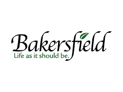
But not to worry. The city evidently saw the error of their ways and in recent years adopted this...

Let's just ignore the ridiculous tagline, which comes across as either a cruel joke or a Gypsy curse. Looking at the logo itself, I have to say it's a huge improvement. Unlike the city itself, it's clean and elegant. The Bible script is a nice hat tip to the Jesus people. Probably a smart move in a town where people drive around with life size wooden crucifixes in the beds of their pickups. And the little leaf is a subtle wink and a nod to the vast Ag influence. To outsiders it probably reads as a fresh, new sprout. If you live here, you'd see it as wilting in the heat. Works wither way.
So overall, I have to say, well done Bako.
